In the dynamic landscape of Fast-Moving Consumer Goods (FMCG), every inch of a retail store speaks volumes. The orchestrated dance of layout and design is not just about aesthetics; it's a strategic symphony that captures hearts, minds, and wallets.
Let us delve into the realm of field activation and in-store merchandising and unlock the secrets to crafting immersive shopping experiences that elevate brands and delight consumers.
Understanding Store Layout: Where Strategy Meets Shopper's Journey
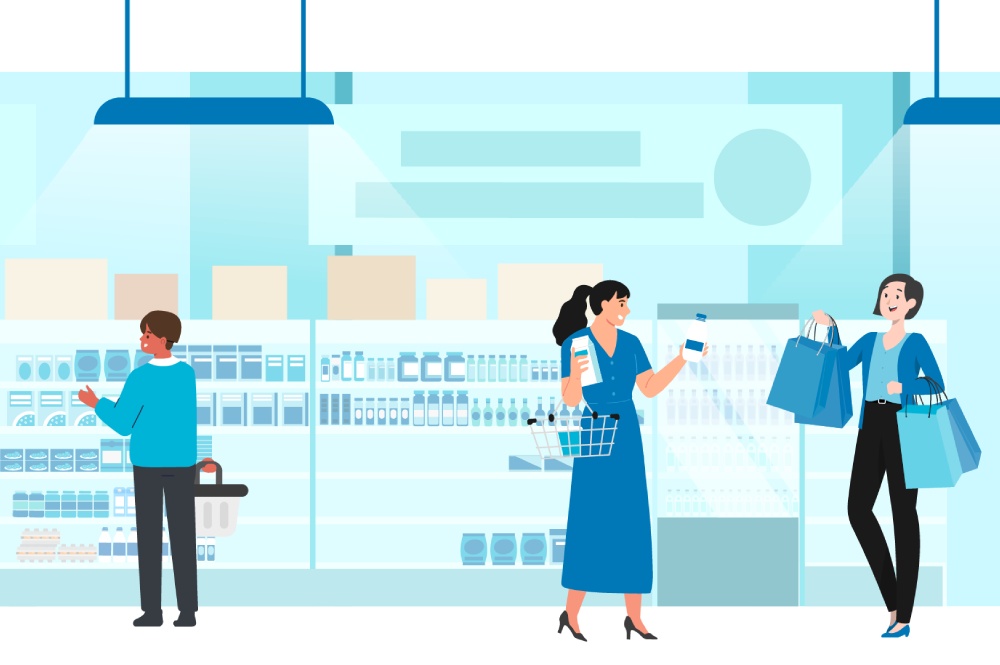
Step into any store, and you are stepping into a meticulously planned environment. From the grid layout that guides your every move to the free-flow design that beckons exploration, every choice is intentional. The store layout, a crucial component of the physical configuration of a store, encompasses the arrangement of products, aisles, and overall spatial design.
The significance of a practical layout cannot be overstated, as it plays a pivotal role in directing customers seamlessly through the store, simplifying their quest for desired items, and even potentially introducing them to previously undiscovered products.
It is essential for the layout to harmonize with the retailer's strategic objectives, whether those objectives revolve around optimizing the visibility of high-margin merchandise, spotlighting featured items, or crafting a specific trajectory for customer foot traffic.
The Grid Layout. The grid layout, a prevalent arrangement in grocery stores and convenience outlets, exhibits a structured organization of aisles in a grid-like fashion. This meticulous layout serves the dual purpose of streamlining customer movement and simplifying product localization. Its efficiency and predictability substantially expedite customers' store navigation, allowing them to traverse the store's expanse efficiently.
The Free-Flow Layout. In contrast, the free-flow layout, often favored in boutique retail settings, manifests a more organic and unrestrained arrangement. This layout is deliberately designed to cultivate an environment that promotes casual browsing and exploration, thereby fostering a relaxed and unhurried shopping experience.
The Loop Layout. Also known as the racetrack layout, the loop layout guides customers along a predefined path within the store. Doing so ensures that customers are systematically exposed to a wide array of products, facilitating an extensive product discovery experience and potentially boosting sales through enhanced product visibility and accessibility.
At DKSH, we understand that the layout is not just about convenience; it is about curating experiences. Our expertise lies in harmonizing strategic objectives with shopper behaviors, ensuring every aisle tells a story and every corner invites discovery.
Sources:
Kazi Mustafizur Rahman has over two decades of experience in the FMCG industry across 15 Asian markets. He is a seasoned leader and currently holds the position of Senior Director, Group Field Activation, DKSH Consumer Goods. Kazi's career includes key roles in go-to-market strategies, in-market execution, and data insights and analytics at industry giants like Unilever, and Reckitt Benckiser. He is an expert in retail execution management, data and analytics management, sales, trade marketing, and channel strategy, and has a profound understanding of the retail environment and trade dynamics.